TheJakartaPost
Please Update your browser
Your browser is out of date, and may not be compatible with our website. A list of the most popular web browsers can be found below.
Just click on the icons to get to the download page.

Popular Reads
Top Results
No results found. Please check your search term and try again
Can't find what you're looking for?
View all search resultsPopular Reads
Top Results
No results found. Please check your search term and try again
Can't find what you're looking for?
View all search results[INSIGHT] Stop COVID-19 data blunders to save lives
On Dec. 3, the number of single-day COVID-19 cases in Indonesia rose to a record 8,369. The COVID-19 task force said this might have been caused by technical issues due to the inadequate system used to accumulate real-time data.
Change text size
Gift Premium Articles
to Anyone
Share the best of The Jakarta Post with friends, family, or colleagues. As a subscriber, you can gift 3 to 5 articles each month that anyone can read—no subscription needed!
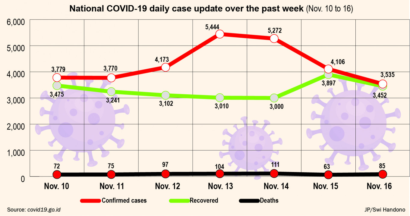
On Dec. 3, the number of single-day COVID-19 cases in Indonesia rose to a record 8,369. The COVID-19 task force said this might have been caused by technical issues due to the inadequate system used to accumulate real-time data.
In Papua this meant that two weeks worth of cases – 1,755 – were counted as a daily figure. If the glitch was real, then Papua was supposed to have recorded 125 new cases on average per day.
This major data blunder has once again cast doubt on the reliability of government data on COVID-19 cases. During the pandemic, real-time data is crucial for the government as a benchmark for policy making, thereby helping it decide how to respond best and how to recover. Moreover, data-driven decisions are crucial for enforcing strict containment and social distancing measures, such as large-scale social restrictions (PSBB) in high-risk regions.
The different standards local governments apply in reporting new cases will lead to an incomplete view of the risks that the disease has brought to local governments and the national government. Some of the new cases were reported a few days late. Other local administrations even reported accumulated cases.