TheJakartaPost
Please Update your browser
Your browser is out of date, and may not be compatible with our website. A list of the most popular web browsers can be found below.
Just click on the icons to get to the download page.

Popular Reads
Top Results
No results found. Please check your search term and try again
Can't find what you're looking for?
View all search resultsPopular Reads
Top Results
No results found. Please check your search term and try again
Can't find what you're looking for?
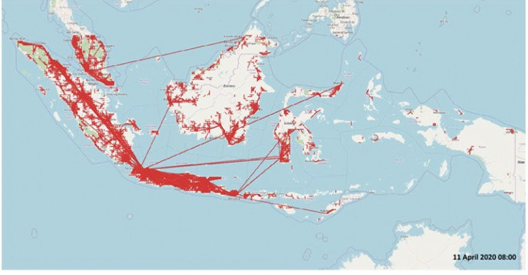
View all search resultsSuppressing mobility to flatten the curve: Preliminary findings from Facebook data
We analyzed the movements of people who logged into Facebook in Indonesia on April 11 at around 8 a.m. and this is what we found out.
Change text size
Gift Premium Articles
to Anyone
Share the best of The Jakarta Post with friends, family, or colleagues. As a subscriber, you can gift 3 to 5 articles each month that anyone can read—no subscription needed!
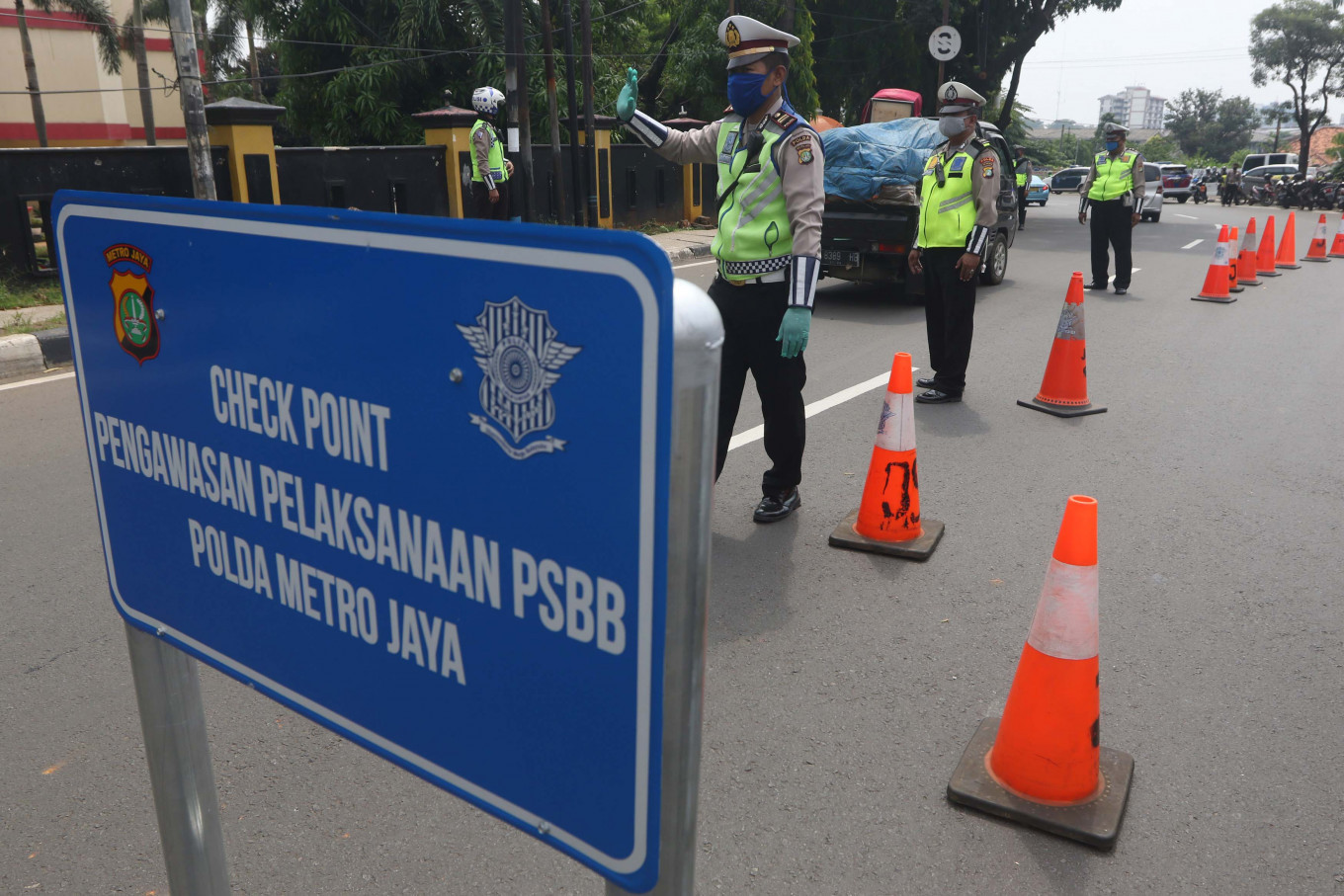 Police officers check vehicles entering Jakarta in Lebak Bulus, South Jakarta, on April 10. (JP/Dhoni Setiawan)
The challenge in monitoring people's movements during this pandemic is the lack of data. When the data is available, it is mostly of low quality with a considerable lag period. The Facebook Disease Prevention Map provides real-time quality data that could help such an endeavor. Considering the large number of people who use Facebook in Indonesia, such data could be very useful to monitor people's mobility with a lag time of between one and two days.
We analyzed the movements of people who logged into Facebook in Indonesia on April 11 at around 8 a.m. and this is what we found out. From the data, we found that most movements took place in Java and Sumatra and that the geographical make-up of islands outside of those two major islands, distance between regions, lack of transportation and low population density, did put a lid on people's movement. From the data we know there was a total of 1.5 million movements of people within the whole area observed.
On top of data on people's movements on a given date, which is updated daily, Facebook also provides data from the previous 45 days. From the data, we can analyze if mobility has decreased after the COVID-19 pandemic hit.
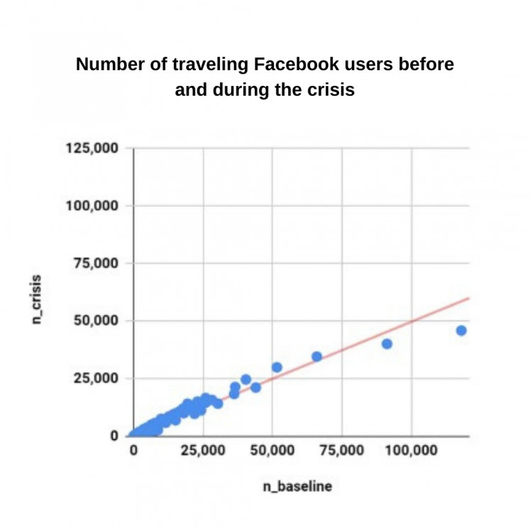
Graph 1 shows a scatter diagram with the vertical axis representing total movements (entries and exits) on April 11 (n_crisis). The horizontal axis represents total movements during the 45 days prior (n_baseline). The regression line below 45 percent shows that there was a decline in the movement of people activating their Facebook location feature. The regression line slope of 0.5 shows that on average there was a reduction of around 50 percent in people's movement compared to the pre-crisis figure (n_baseline = total number of movement in 45 days prior).
From this graph, we can also see that four regions have seen between 20,000 and 50,000 movements of people during the crisis. Graph 2 and 3 show which regions have registered the largest number of movements.
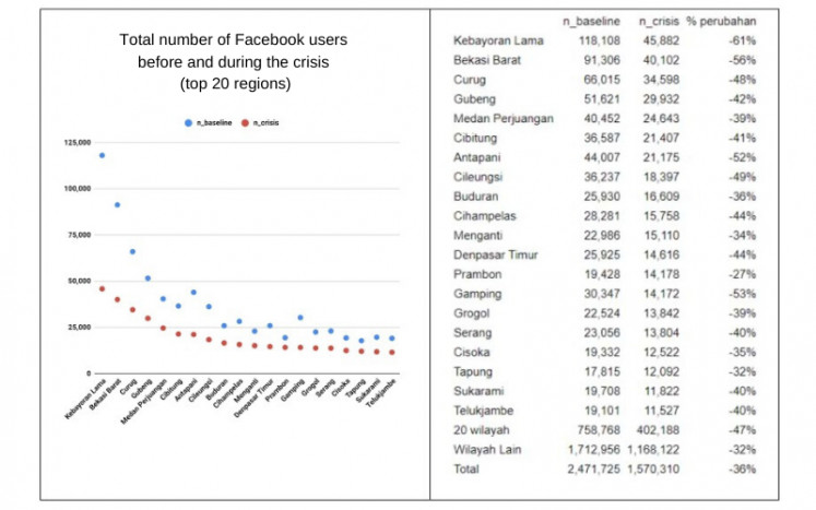
The names on the map do not represent administrative boundaries like subdistricts of regencies but instead constitute a centroid of tiles in a map. So, Kebayoran Lama can roughly represent Jakarta. The 20 regions on the graph have seen the highest level of mobility and most are major cities in Java. And although the 20 regions have seen a large number of people making trips, they also registered the steepest plunge in the number of movements, around 47 percent. Other regions have seen a 32 percent drop compared to prior to the COVID-19 crisis.
All graphs and tables show aggregate numbers of inbound and outbound trips. We have not provided a more detailed graph separating inbound and outbound travel given that the pattern of its graph does not depart far from that of the total trips. In most cities, inbound and outbound travel could be split into a 50:50 ratio. For instance, Jakarta has seen 46,000 trips, made up of 21,000 inbound trips and 25,000 outbound trips. This means that the net outflow is only around 4,000.
The preliminary findings that we have gleaned from Facebook data could serve as a proxy to the actual movements of Indonesians during the COVID-19 crisis and shows that there is high mobility in major cities of Java and Sumatra, albeit in reduced numbers.
Will the 50 percent reduction in major cities and 30 percent in other regions be enough to flatten the curve? We can certainly argue that it is not enough.
Senior researcher, Economics Department, Center for Strategic and International Studies (CSIS)